本文介绍利用python在时间坐标下对地震事件进行统计和可视化。包括地震频度的统计、频度图的绘制以及M-t图的绘制。
重点需要掌握,时间轴上统计和绘图时需要完成的时间段和时间点的转换,以及时间轴样式的设置。
绘制M-t图
¶简介
在python中,利用matplotlib.pyplot.stem可以画茎叶图,stem的参数可以改变垂直线的类型,顶点的颜色大小等。
1 | stem(x,y, linefmt=None, markerfmt=None, basefmt=None) |
¶说明
x,y分别是横纵坐标;linefmt:垂直线的颜色和类型;linefmt=‘r-’,代表红色的实线;basefmt指y=0那条直线;markerfmt设置顶点的类型和颜色,比如C3.,C(大写字母C)是默认的,后面数字应该是0-9,改变颜色,最后的.或者o(小写字母o)分别可以设置顶点为小实点或者大实点,空格表示没有顶点。
以下为线型对应的字符
| 字符 | 线型 |
|---|---|
| ‘-’ | solid line |
| ‘–’ | dashed line |
| ‘-.’ | dash-dot line |
| ‘:’ | dotted line |
绘制N-t图
¶简介
python中可以利用matplotlib.pyplot.bar,通过绘制bar实现地震频度图的绘制。
工具:
matplotlib.pyplotmatplotlib.datespandas
1 | import matplotlib.pyplot as plt |
¶参数说明
xerr, yerr:
scalar or array-like of shape(N,) or shape(2, N), optional;If not None, add horizontal / vertical errorbars to the bar tips. The values are +/- sizes relative to the data:
- scalar: symmetric +/- values for all bars
- shape(N,): symmetric +/- values for each bar
- shape(2, N): Separate - and + values for each bar. First row contains the lower errors, the second row contains the upper
errors. - None: No errorbar. (Default)
实例
Notice!
本节最关键的问题在于地震数目的统计,和时间坐标的控制
1 | #!/bin/python |
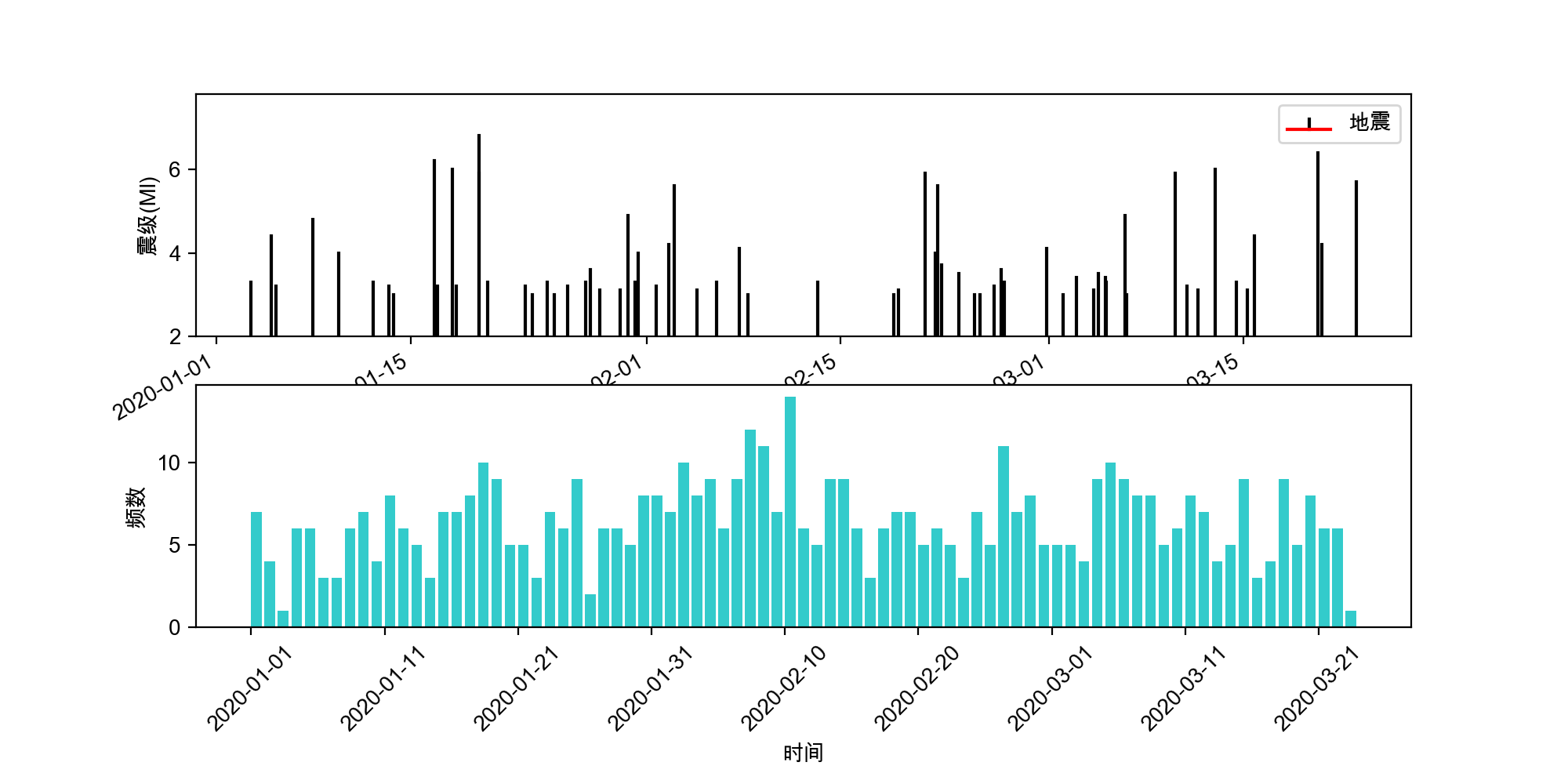
运行以上代码生成如下图片
¶说明
以下为在时间坐标下绘制数据时的关键顺序
- 读取数据后,利用pd.set_index设置时间列为index
- 利用时间index对表数据进行统计
eq.resample('d').count().toperiod('d'),此处d表示按天采样,获取每日地震数量。
注意:此时生成的dataframe中index为时间段,不可直接用于时间坐标(时间坐标用时间点) - 设置x轴时间格式,
ax.xaxis.set_major_formatter(mdate.DateFormatter('%Y-%m-%d')) - 对index时间段取start_time作为时间点,利用始末时间点生成时间序列,作为x轴坐标;
pd.date_range - 绘图
Notice:
可选参数color, edgecolor, linewidth,xerr和yerr可以是标量或长度等于bar数目的序列。这是绘制条形图作为堆叠条形图或烛台图的基础。:wstar:
详细信息:xerr和yerr被直接传递到:meth:‘errorbar’,所以他们也可以有形状2xN,独立规定上下误差。